Building the plots necessary to find Bigfoot with Plotly’s Dash framework.
Warning
I wrote this when Plotly Dash was brand new. Though the fundamental process and setup is the same, some of the details are quite a bit simpler now than they were when I wrote this.
In particular, the Dash Bootstrap Components library replaces the manually set CSS classes and works really well. Plotly Express makes generating the map easier too.
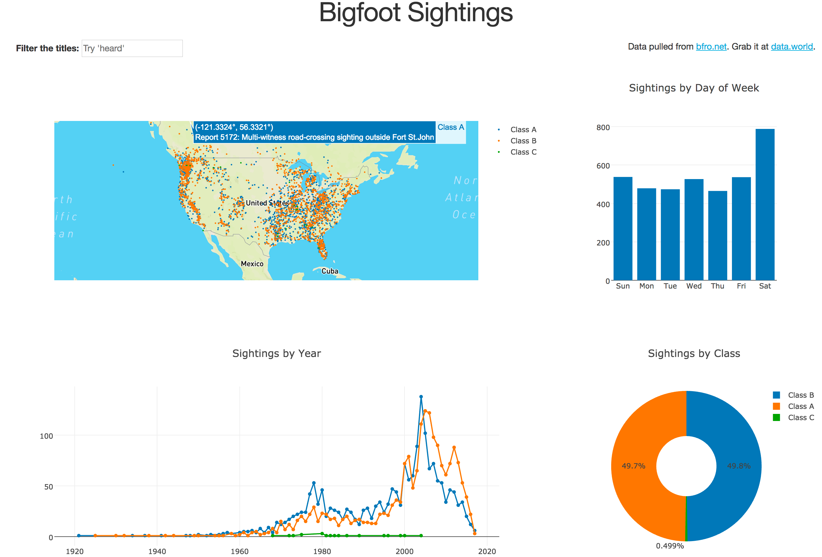
In part 1, I unveiled my latest plan to make one million dollars by finding Bigfoot using Plotly’s Dash framework. I walked through the overall structure of the app, the data, and the map visualization. In this part I’ll add some more plots to the layout - a line/scatter plot of sightings over time, a bar plot of the sightings by day of week, and a donut chart of the percentage of sightings for each sighting class. In part 3, I’ll wire the plots to an interactive element - a search bar that filters the titles. The final product will look like this:
Obviously I recommend reading part 1 of this series before this one, but it’s probably most important to read through the Dash user guide because I’m not going to explain everything in the code - only the parts that aren’t obvious. My goal isn’t to explain the elements of the framework, it’s to walk through a complete app and obviously make a million dollars.
I’ll start by walking through the plots, then update the layout. The approach for the plots I’m taking is the same one I used for the map: write a function that takes all of the sightings and returns the data structure for the plot.
Sightings by Year
Before building this plot I need to create a helper function that extracts the year from the timestamp. The timestamps are in ISO-8601 format, which means they look like this:
2000-06-16T12:00:00Z
It’s pretty easy to do this with the builtin Python datetime module. Put this function above the point where you read in the data (I’ll explain why that’s important in a minute).
import datetime as dt

# This will get used more than once.
TIMESTAMP_FORMAT = "%Y-%m-%dT%H:%M:%SZ"

def sighting_year(sighting):
    return dt.datetime.strptime(sighting['timestamp'], TIMESTAMP_FORMAT).year
All that function does is cast the string as a datetime object and extract the year. The reason I want this above the rest of the code is that there are a few sightings that really skew the axes on the time plot - one that super old, and another that’s hopefully been misrecorded as having happened in 2053. Revisiting the code where we read in the data, make the following change to take out the odd sightings out:
# Read the data.
fin = open('data/bfro_report_locations.csv','r')
reader = DictReader(fin)
BFRO_LOCATION_DATA = \
[
    line for line in reader
    ################################ NEW CODE ##################################
    if (sighting_year(line) <= 2017) and (sighting_year(line) >= 1900)
    ############################################################################
]
fin.close()
Now that the dataset is a little cleaner it’s time to build the plot.
from toolz import countby, first

def bigfoot_by_year(sightings):
    # Create a dict mapping the
    # classification -> [(year, count), (year, count) ... ]
    sightings_by_year = {
        classification:
            sorted(
                list(
                    # Group by year -> count.
                    countby(sighting_year, class_sightings).items()
                ),
                # Sort by year.
                key=first
            )
        for classification, class_sightings
        in groupby('classification', sightings).items()
    }

    # Build the plot with a dictionary.
    return {
        "data": [
            {
                "type": "scatter",
                "mode": "lines+markers",
                "name": classification,
                "x": listpluck(0, class_sightings_by_year),
                "y": listpluck(1, class_sightings_by_year)
            }
            for classification, class_sightings_by_year
            in sightings_by_year.items()
        ],
        "layout": {
            "title": "Sightings by Year",
            "showlegend": False
        }
    }
The real action in this function is building sightings_by_year.
The data structure is a dictionary mapping the classification to a list of (year,count).
To build it, I group by the classification.
After that, for each classification do a count by year sorted by the year (sorted(... , key=first)).
As for the plot data structure it’s fairly straightforward - just put each class in a trace and pluck the zeroth element (year) for x and the first element (count) for y per trace. I decided not to show the legend because every plot gets the same color scheme and the map already has one.
Sightings by Day of Week
As with the sightings by year plot, I’ll need a helper function to extract the day of the week from the report timestamp. I can use the same format string and just write a different helper.
def sighting_dow(sighting):
    return dt.datetime.strptime(sighting['timestamp'], TIMESTAMP_FORMAT)\
                      .strftime("%a")
Since the datetime type doesn’t have an attribute with the day of the week I have to use strftime to get it, but other than that it’s basically the same function we have for extracting the year.
The plot will get built in two stages: first, group by the day of week, then build the data structure for the plot. I won’t worry about breaking this plot down by classification, but if you want to give it a shot it is fairly straightforward.
def bigfoot_dow(sightings):

    # Produces a dict dow => count.
    sightings_dow = countby("dow",
        [
            # Extract the day of week for each sighting - ignore the rest.
            {
                "dow": sighting_dow(sighting)
            }
            for sighting in sightings
        ]
    )

    # Fix the order for the day of week axis.
    dows =  ["Sun", "Mon", "Tue", "Wed", "Thu", "Fri", "Sat"]

    return {
        "data": [
            {
                "type": "bar",
                "x": dows,
                # Get the count, or zero if it isn't present.
                "y": [get(d, sightings_dow, 0) for d in dows]
            }
        ],
        "layout": {
            "title": "Sightings by Day of Week"
        }
    }
There are a couple of things to pay attention to in this function.
The first is that I’ve fixed the order of the days of the week for the x axis, which ensures that the order is sane and consistent.
When the interactions are added later, the order of the x axis won’t change even as the underlying data changes.
The other is the get(d, sightings_dow, 0), which pulls the counts for the day of the week, or zero if it isn’t present.
Again, that’s not a big deal now because we’re passing it all of the data, but when the interactions are added this will ensure that the function doesn’t throw an error if there isn’t an entry in sightings_dow.
Sightings by Classification
This plot’s by far the simplest - it’s a donut chart of the classifications. There’s really nothing we haven’t seen before so I’ll just show it.
def bigfoot_class(sightings):
    sightings_by_class = countby("classification", sightings)

    return {
        "data": [
            {
                "type": "pie",
                "labels": list(sightings_by_class.keys()),
                "values": list(sightings_by_class.values()),
                "hole": 0.4
            }
        ],
        "layout": {
            "title": "Sightings by Class"
        }
    }
Layout
Obviously the layout of the app is going to need to change before cramming the new plots in there. The code change for the layout is pretty serious, so I suggest nuking the old one and starting fresh. The layout I’m going for will have three rows (the final product will have four):
- Title
- Map + Sightings by Day of Week
- Sightings by Year + Sightings by Class.
Because the map and sightings by year plots are most important, I’m going to make them 8 units across. The other plots will be four units across (recall Bootstrap columns are subdivided into 12 units). Basically the layout will look like this:
Row
    Column-12 (title)
Row
    Column-8 (map)
    Column-4 (sightings by day of week)
Row
    Column-8 (sightings per year)
    Column-4 (sightings by class)
Hopefully with that 50,000 foot view the Python code won’t seem like a lot - it’s really easy to build incrementally as long as you’re consistent with your indentation.
app.layout = html.Div([
    # Row: Title
    html.Div([
        # Column: Title
        html.Div([
            html.H1("Bigfoot Sightings", className="text-center")
        ], className="col-md-12")
    ], className="row"),
    # Row: Map + DOW
    html.Div([
        # Column: Map
        html.Div([
            dcc.Graph(
                id="bigfoot-map",
                figure=bigfoot_map(BFRO_LOCATION_DATA))
        ], className="col-md-8"),
        # Column: Day of Week
        html.Div([
            dcc.Graph(
                id="bigfoot-dow",
                figure=bigfoot_dow(BFRO_LOCATION_DATA))
        ], className="col-md-4")
    ], className="row"),
    # Row: Year + Class
    html.Div([
        # Column: Year
        html.Div([
            dcc.Graph(
                id="bigfoot-by-year",
                figure=bigfoot_by_year(BFRO_LOCATION_DATA))
        ], className="col-md-8"),
        # Column: Class
        html.Div([
            dcc.Graph(
                id="bigfoot-class",
                figure=bigfoot_class(BFRO_LOCATION_DATA))
        ], className="col-md-4")
    ], className="row")
], className="container-fluid")
With the plots wired into the new layout, it’s time to fire this thing up. Run
python app.py
in the shell and hit localhost:8050 in the browser.
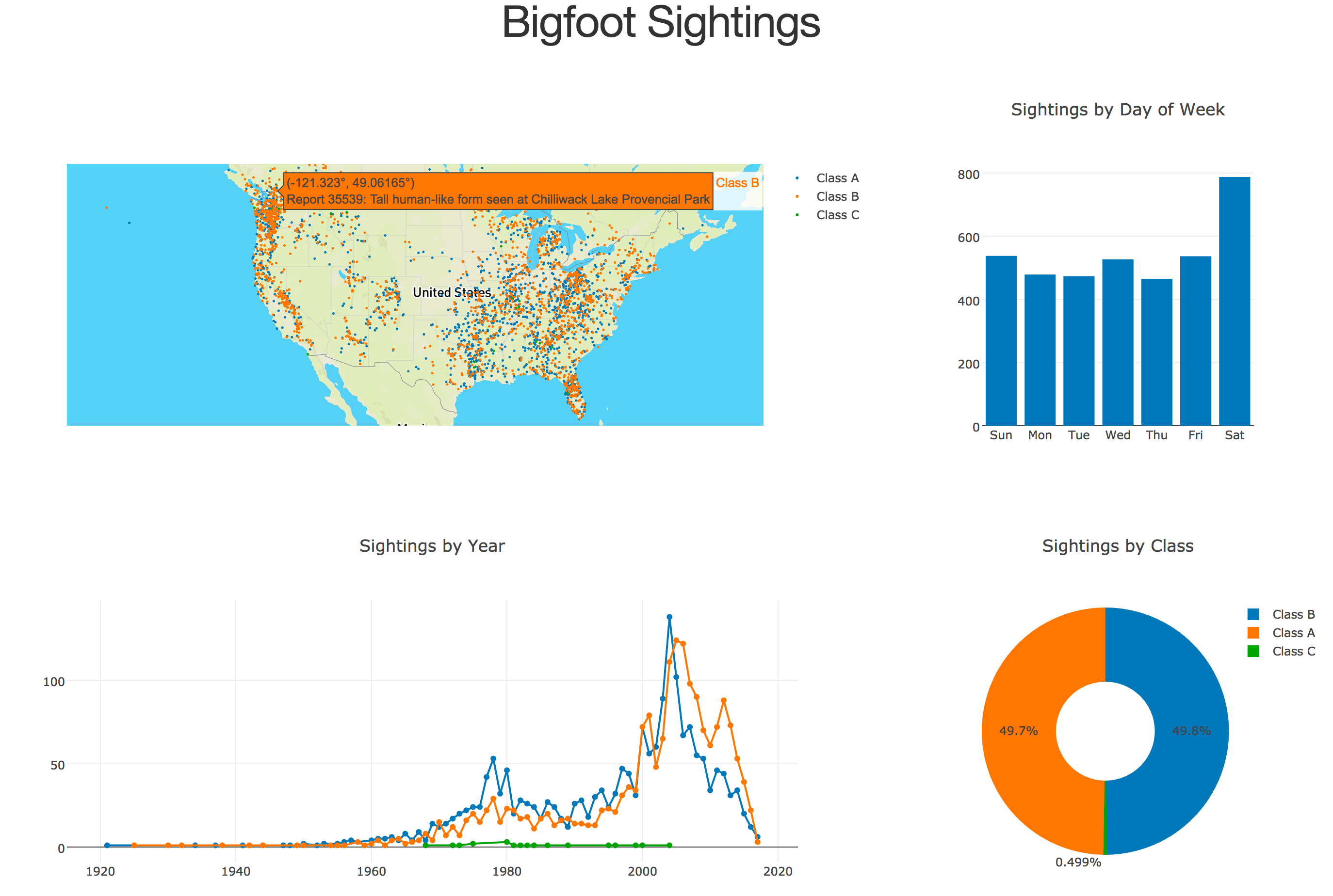
You should see this:
Conclusion, Part 2
In this post I walked through several plotting functions, all of which have basically the same signature: take a list of dictionaries and return a dict with the “data” and “layout” fields needed to produce the plot in the browser. For most of the data manipulation I used functions from toolz, but it’s not terribly difficult to do the same thing with pandas. Hell, it might even be faster, but I’m not sure it would be noticeably faster. After building three additional plot functions, I modified the layout to take better advantage of the Bootstrap grid system and wired the plots into it.
We’re almost there, so it’s time to start thinking about what you’d do with a million dollars. There’s just one more thing to do: put that input bar together and wire it to the dataset for the interactions. That’s the sole topic of part 3.
If you’re impatient, the full source code for everything is already on GitHub.
Continue on to part 3 to finish the app by adding an interactive search bar.